
MOTION GRAPHIC AND VIDEOGRAPHY

Porto app official website
Revamp Website design to increase the usability and visibility of apps
Product Design / Design Improvement / Website design
Brief
Redesign our official website that more seamless and having a good user experience than previously version
Problem Statement

Users find it difficult to login and signup which causes many users to not be able to enter porto

For new users, they don't understand what porto is and also the value of porto because of the structure of the content

users and stakeholders feel that the existing website is still not seamless and also has a good interface
Take a look the old Design
Information Architecture
before I start the new design I try to re-audit the information architecture of the website and also focus on the user flows that are problematic in this context is the login and signup user flow.
According to the customer service team, there are around 2000 users who cannot log in and signup on the Porto website. so they have to login and sign up manually by asking the user to send an email and password. this is very risky for Porto, especially in the security aspect
Userflow login & Sign up (New flow)

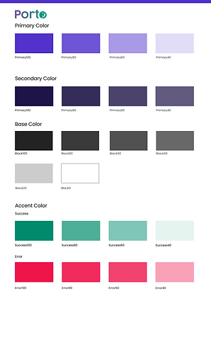
Recalibrate Porto Design System
Porto Products itself doesn't have a design system, that's why I tried to make the first version based on the branding aspect of their logo. starting from the foundations to the components used in the website


New Design Approach
Homepage
Membership Page